Practitioners 22: Dave Gibbons Pt 1

Born 14 April 1949, Dave Gibbons has already made his way into the hallowed halls of historical figures associated with comic books. It is no exaggeration to say that Gibbon’s name could appear alongside great artists and writers like Ditko, Miller, Eisner and Kubert. But while Gibbons is associated with one of the greatest (certainly the most critically and commercially successful) series of all time – his is not a career that is shrouded with his name. Whereas Quitely, Romita Jr and Kubert can occassionally dwarf a project and become the defining feature of it – Dave Gibbons has achieved something much more noteworthy – the project he works on and not his name remains the talking point of projects he is associated with. Dave Gibbons is a prolific Practitioner with a style that puts content and communication of the story first and foremost and has allowed (in a way that no other artist has been able to facilitate) a series to transcend the medium and be considered a work of awarded literature. No other artist in the medium has achieved this and that is why Gibbons is one of the most noteworthy practitioners in the list – effectively for not being as deliberately noteworthy as some of his peers. For those who know, Gibbons is a legend and one of the foremost practitioners working today.

Gibbons broke into British comics by working on horror and action titles for British 2000AD publisher DC Thomson and IPC. With the inception of the quintessential British weekly comic publication, launched in 1977, Gibbons was in a position to contribute artwork from the very start on Prog 01. As a founding member of the title Gibbons went on to draw 24 installments of Harlem Heroes (written by Pat Mills and making up the original 2000AD ‘Thrill 5’ Line-up. It was a cross between kung fu films and the Harlem Globetrotters with the crazily violent Aeroball set in a desensitised 2050). Gibbons almost wasn’t the artist on the project, originally intended to be drawn by Carlos Trigo but for reasons unknown Gibbons appeared in the starting line up. From Prog 25, Massimo Belardinelli drew the remaining episodes of the first run and remained its regular artist for the strip’s reinvention as Inferno.

Mid-way through the comic’s first year Gibbon’s began illustrating Dan Dare, a project close to his heart as he had always been a fan of the original series, his own work inspired by Frank Hampson who had provided the visuals for DD in its earlier years. Gibbons was also inspired by Frank Bellamy, (the noteworthy) Don Lawrence and Ron Turner. whose ‘style evolved out of (his ) love for the MAD Magazine artists like Wally Wood and Will Elder.

Also working on Ro-busters, Gibbons became one of the msot prolific of 2000AD’s earliest creators, featuring in 108 of the magazine’s first 131 Progs (issues). He returned to 2000AD in the early eighties to create Rogue Trooper with writer Gerry Finley-Day, about a cloned battle-hardened soldier and his cybernetically enhanced equipment imbued with the personalities of his fellow soldiers, providing the fans with an acclaimed early run that saw it roll well beyond his tenure under many more artists.

It was around this time he formed a working relationship with Alan Moore, working most regularly with him on his Tharg’s Future Shocks feature.

On the roll into the ’80’s, Gibbons took on the position of lead artist on Doctor Who Magazine, undoubtedly another character that’s stood the test of time more than a little well. The Doctor Who Storybook 2007 features the name ‘Gibbons’ in a list of the greatest artists of all time.

One of the British comic book talents identified by Len Wein in 1982, Gibbons was hired to draw Green Lantern Corps backup stories within the pages of Green Lantern for DC, starting with a Green Lantern story in Green Lantern 162 (March 1983) with writer Todd Klein, as well as the concurrently released ‘Creeper’ two-part back-up story in Flash 318-319. By Green Lantern 172 (January 1984) Gibbons was on the lead feature with Len Wein while still illustrating the back-up features through to issue 181. Finishing his run in issue 186 (March 1985) he briefly returned however to pencil a back up feature ‘Mogo doesn’t socialize’ with Alan Moore in Issue 188. Gibbons would later return as writer on Green Lantern Corps back up stories and his association and partnership with Moore was about to go from strength to strength, leaving him responsible for one of the foremost works of comic book fiction ever created, and by that I don’t mean ‘The Man Who has Everything,’ written in the 1985 Superman Annual by Moore and pencilled by Gibbons and collected in Moore’s greatest works for DC reprint a few years ago.

Gibbon’s clear, unrestricted and unfussy style saw him produce work for both DC’s Who Who in the DC Universe Guidebook and Marvel’s The Official Handbook of the Marvel Universe Deluxe Edition. He contributed to Harrier Comic’s Brickman 1 with Kevin O’Neill, Lew Stringer and others. He provided covers for Peter David’s and Joe Orlando’s four-issue The Phantom mini-series and inked Kevin Macguire’s work on the landmark Action Comics 600 and created the cover for issue 601.

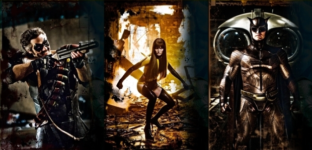
The Comedian, Silk Spectre and Nite Owl : Three characters designed by Dave Gibbons

But in September 1986-October 1987 Gibbon’s joined with Alan Moore and colourist John Higgins and rendered the blood-stained smiley badge firmly in the minds of every comic reader for 25 years. Now one of the best-selling graphic novel’s of all time and the only graphic novel to feature on Time’s ‘Top 100 Novel’s List’ Gibbon’s artwork is notable for its stark utilisation of the formulaic nine-panel grid layout, removing opportunities to embellish or emphasise through scaling or composition – forcing him to rely entirely on his capacity to communicate the effect of each panel within the fixed panel shape and size itself. To have pursued this course and succeeded in the way he did, puts Gibbons in the at the table with some of the top comic book artists of all time as he put away certain stylistic tricks and still rendered a piece of graphic literature that knocked popular novels from a highly sought after list. Its dense symbolism (some suggested by Moore, some by Gibbons) is carried throughout the piece as the conflicting and complex characteristics of the central heroes is cast against a kaleidoscope of recognisable, realistic and perfectly realised environments. Watchmen in the hands of Gibbon’s is a contained beast, twice as savage with its muzzle on. The psychotic Rorschach better realised with Gibbon’s sure, naturalistic style forming a Human around a monster wherein another artist may have depicted a much more emotional and overt depiction of the same character. Gibbons and Moore’s choice to draw Dr Manhattan full frontal nude is never gratuitous and is so innate a part of the character thanks to the clear, anatomically minded style of Gibbons that the feature film 2 years ago featured the same thing – so much an ingrained visualisation of a man’s isolation from his own society that it would have altered the character immeasurably to have simply given him pants.

In the Watchmen, alongside Moore, Gibbons created a timeless piece of literary history. He succeeded in depicting a disparate group of Supermen so flawlessly that Moore’s words can almost be redundant. The characters so well realised that you understand the innate characteristics they represent. Although originally intended to be the characters bought by DC from Charlton comics, the characters that were adapted from them (due to obvious concern that having bought them Moore would kill two and remove one from Human kind completely within 12 months) are familiar archetypes without ever being cliched. From the pug faced Comedian, scarred through years of hard living to Moloch, the curve eared ex-supervillain suffering from cancer, Gibbon’s gave them enough humanity to communicate all the frailties and complexities of Human beings without even once diminishing their inherent heroism.

The unmasked Rorschach – a pathetic, ungainly and slightly ugly figure when revealed from under his cowl is trapped in a cell being threatened by a criminal boss and his goons directly outside. By the end of the sequence all of the characters (save Rorschach) are dead in grotesque and memorable ways. All of this takes place in a space little larger than a toilet cubicle, in panels of 3x3x3 of equal size and largely using the same head on angle. It remains one of the most effecting and brutally challenging moments in modern comic books and its all thanks to Gibbon’s unswerving and meticulously precise style.

A giant space squid (or so it appears) destroys a city centre at the end of the Watchmen. Undoubtedly a moment that could have so easily been – and borders the absurd and tacky (and effectively the only detail of the film altered because of the difficulties in communicating it) and Gibbons communicates visually one of the most harrowing and frightening depictions of mass death to have appeared in any graphic novel with carefully rendered people piled high and strewn about the streets representing mega-death in its coldest aftermath.
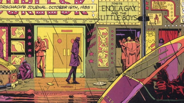
Rorschach appears undisguised in early pages in crowd scenes and your eye never falls on him as he’s depicted as clearly and as obscurely as all others. But on a second glance, having been introduced to the character later on – all of what he is as Rorschach is present in the figure but entirely absent without the later revelation. Art on that level is masterful. Characterisation in remission, relying on something you will discover in order to validate it. That is Dave Gibbons the artist. Every panel retains as much information as the story needs you to know at that moment, and a thousand and one things you can acknowledge when your ready. Gibbon’s work doesn’t bait the eye – it waits for when the eye is ready for it. Few artists are more satisfying to revisit.

PART 2 ON THURSDAY. INCLUDING TALES OF THE BLACK FREIGHTER, HIS INFLUENCE ON THE WATCHMEN FILM AND GREEN LANTERN : BLACKEST NIGHT

Practitioners 17: Brian Bolland (Part One)

Brian Bolland (born in 1951) is a british comic artist known for his meticulous, highly detailed line work and eye catching compositions. Reknowned as one of the ultimate Judge Dredd artists for British comic anthology 2000AD, he spearheaded the ‘British Invasion’ of the American Comics Industry with Camelot 3000 (with Mike W. Barr), the first ever 12 issue Maxi-series to be released by DC comics.

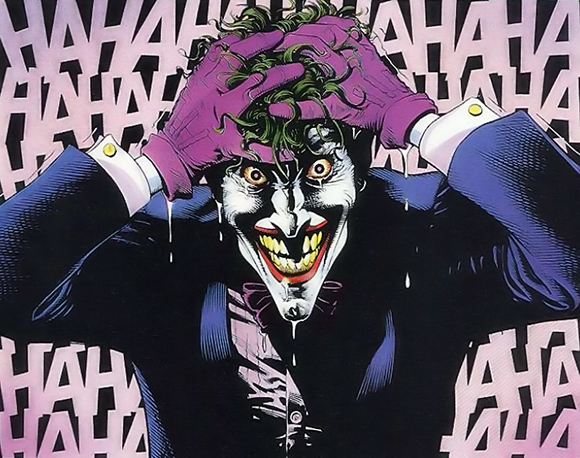
Most notable, however is his masterwork. Along with writer Alan Moore Bolland created one of, if not the definitive examples of Batman in the critically acclaimed Killing Joke.

Drawn into comics in 1960 – a couple of years after they began to arrive on the shores of England (in 1958) – by Dell Comics Dinosaurus! which appealled to his love of Dinosaurs at that age. Turok, Son of Stone and DC’s Tomahawk furthered his childhood fascination with the form and before long he was writing and drawing his own work from his home in Butterwick, Lincolnshire. A fascination with DCs heroes, in particular Batman and Robin was formed from seeking covers featuring ‘any big creature that looked vaguely dinosaur-like, trampling puny humans.’

It was in 1962, aged 11, most likely from comic books bought on a family holiday to Skegness that he came across Carmine Infantino’s Flash and Gil Kane’s Green Lantern and the Atom. His interest locked firmly on the artists of DC at the time, not favouring Marvel, feeling the covers were crude and the paper quality crude. Even at so young an age Bolland remembers taking direct reference from the early artists of the classic superhero series – including Joe Kubert (dad to Andy and Adam of X fame) and Mike Esposito. His appreciation of the work of Jack Kirby came through the eyes of a seasoned professional much later. His interest was in no way limited to US imports as he enjoyed the comparable UK strips of Syd Jordan’s Jeff Hawke and David Wright’s Carol Day as well as Valiant, a weekly comic book collection by Brit practitioners such as Eric Bradbury (Mytek the Mighty) and Jesus Blasco’s Steel Claw.

Coming from a quiet household Bolland embraced the cultural revolution taking place throughout his country while studying O Levels and A Levels in art, moving on to five years at art school in 1969 learning graphic design and Art History.In 1973 he wrote a 15,000 word dissertation on Neal Adams – an artist his teachers had never heard of. He is sited as saying that ‘During my five years in three art schools I never learnt a single thing about comics in any form from any of my tutors.’

His feverish need to understand the form led him to study off his own back the American legends of the burdgeoning art form from across the pond; Foster, Herriman, Alex Raymond and Winsor McCay, Noel Sickles, Mily Caniff and Roy Crane as well as the Europeans… Moebius, Manara, Breccia. Later the Filipinos – Alex Nino, Nestor Redondo. Discovering an untapped resource in these incredible figures of a seemingly undiscovered art form was like sailing the coast of a country no one around him knew existed. In a world in which comic creators are responsible for some of the most influential cultural icons and most reliable film franchises in popular culture its perhaps difficult to understand how exciting this glance at the edge of a culture formally unrecognised in the halls in which he was learning yet precise and clear in its form and intention might have been but I think its a position most of those who collect comic books would wish they could experience. And there he was at the edge of it – having familiarised himself completely with the form. All that was left was to try out for himself.

Bolland self-published fanzines which was published in underground magazines Friendz, International Times and OZ. Following a cover design for RDH Comix featuring Norwich Cathedral. But it was an underground magazine about to hit the big time as ‘the biggest weekly listings magazine’ named Time Out that gave Bolland his ‘first paid job’ producing a proper illustration of Jazz bassist Buddy Guy.

Meanwhile, he produced the first episodes of an adult Little Nemo in Slumberland parody entitled Little Nympho. This took off and he continued to design full page strips for a 50-copy fanzine entitled Suddenly at 2’0 Clock in the Morning as well as smaller strips entitled ‘ the Mixed up Kid’ to the Central School of Art’s college newspaper The Galloping Maggot.

But it was meeting and befriending Dave Gibbons (later of Watchmen / Green Lantern fame) at a comic convention at the Waverley Hotel in London, joining Art Agency Bardon Press Features. A couple of two-page strips featured with DC Thomson but Bolland would refer to this as his ‘lowest time’. However, it was a title through a client called Pikin that offered Bolland a chance to get his hands dirty. It was for a title to be sold in Nigeria (the first of its kind) and was a weekly comic book featuring an African Superhero named ‘Powerman’. He quickly realised that Gibbons could produce a page a day and struggled initially to keep up the pace. The pages had to simple and numbered because of the lack of familiarity in Nigeria to this form of work. Not only was this work “the best way to learn the simple rules of comic book storytelling,” but “better still, it was going someplace where nobody I knew could see it.” He “drew around 300 pages of that very straightforward, simple-to-follow work, and I guess the storytelling flowed naturally from that.” Even so friends from his school days had to help him occasionally to complete as he ‘was always struggling to get the last eight to ten pages finished’. A little help was also offered from Dave Gibbons and 2000AD and League of Extraordinary Gentlemen artist Kevin O’ Neill.

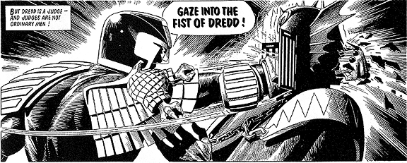
But it was here he struck a particularly lantern jawed law man associated with the success of so many of the greatest artists from the UK. As Gibbons joined Carlos Ezquerra at 2000AD for Prog 1, Bolland remained on Powerman but as it dropped monthly his agent at Bardon, Barry Coker offered him a cover on 2000AD. From his first he created more than a third of the first 30 covers. Moving inside 2000AD as well as taking on occasional inking duties on Gibbon’s Dan Dare was the dream and for prog 41, editor Nick Lauman called on Bolland to complete an unfinished Judge Dredd story from when on he became a regular artist on the title. He offered art to the most prominent Dredd storylines ‘Luna-period’, The Cursed Earth’, ‘ The Day the Law Died’, The Judge Child Quest’ and ‘Block Mania.’ He found it difficult to deal with the requirement to produce double page spreads (as Dredd started at the time) and Bolland struggled to complete the required work, eventually splitting it between himself and Mike McMahon.

Bolland was heavily influenced by McMahon’s ‘impressionistic’ style and described McMahon as ‘ the real idea man on Dredd,’ although acknowledging that ‘the average comics reader, certainly at the time, does tend to prefer realism.’ Aping the impressionism of McMahon and applying his own realism ‘finally cemented the iconic image’ according to Mark Salisbury. It was Bolland who created the look of iconic characters featured in Mega City One – namely Judge Death (and the other three Dark Judges) and Judge Anderson. Judge Death was drawn as ‘just another villain in just another excellent John Wagner script’ and was inspired by the look of Kevin O’ Neill’s Nemisis the Warlock. He also drew the great majority of Walter the Wobot: Fweind of Dwedd strips in 2000AD and the first three Dredd issues for the united states as well as a number of covers.

Mix that together with magazine covers for Time Out and every major comics publications (according to Wikipedia) and fanzines such as Nick Landau’s Comic Media News and Arkensword and the ‘hazard cards’ for a game called Maneater. And, as will be remembered around the age of 30 in the Uk completed two covers of the Fighting Fantasy Adventure Game Books and RPG scenario pamphlets for Steve Jackson and Ian Livingstone.

He handled ad work through the agency – in particular Palitoy’s Star Wars toys 1n 1977 and on the associated material for the opening of the comic book shop Forbidden Planet. But his future lay across the sparkling Atlantic Ocean with a comic company that had spawned his interest to begin with…..

CONTD IN PART 2 (THURSDAY).

Practitioners 16: Brendan McCarthy

Brendan McCarthy is an artists artist. A hero of mine following the discovery of his Visual Autobiography, Swimini Porpoise, in which he details almost exclusively in numerous artistic projects his stellar career from his time with Brett Ewins at Chelsea College, through to 2000AD and Hollywood. Realising I was sitting in a room with a man due to go for a drink with this legendary Practitioner’s Practitioner I almost yelped (in fact I may have). Friends with Destroy All Robot’s Darrin Grimwood they share a wry sideways view of the world through a spackled and myriad lens. McCarthy perpetuates his inner thoughts into accessible and engaging picture fields for your eyes to dance about in – possibly naked but almost certainly wearing a silly hat.

A multifaceted pop artist from the very beginning of his career, Brendan McCarthy, unsurprisingly given his moniker, of Irish descent was born in London. Shortly afterwards (at an undisclosed age) he began to create his own home-made comics. Having left Chelsea Art College in London, where he found a penchant for sellotape murals incorporating various popular iconography and his own artwork and developed his distinctive and wild hearted style he moved on to creating Sometime Stories with his erstwhile partner in crime from college, Brett Ewins. His first paid work was Electric Hoax in the British Weekly music paper Sounds with Peter Milligan in 1978. He was snapped up, along with Ewins, to join the burgeoning 2000AD team at DC Thomson.

Unstoppably driven – McCarthy was simultaneously drawing Judge Dredd for 2000AD and concept designing a Dan Dare Live Action Television series for Lew Grade’s ATV in the 1970s.

In 1980, inspired by the book the Razor’s Edge, McCarthy decided to travel the globe ‘on a futile and non-sensical metaphysical pilgrimage, ending up, via Egypt, India and the Himalayas, in Sydney, Australia.’ While there he witnessed the surfing lifestyle and extrapolated from it hybrid Mad Max of the waves concept that birthed the Peter Milligan penned ‘Freak Wave’ – a post apocalyptic surfing story.

Having preempted Waterworld by more than a decade returned to the UK and to drawing comics – most specifically the aptly named Strange Days, an Anthology title printed by Eclipse Comics – alongside his old counterparts Peter Milligan and Brett Ewins. His media-brat superhero Paradax escaped the pages of Strange Days to find a home in a two issue limited series and one of his best loved characters – Mirkin the Mystic ‘a kind of laconic, psychedelic, Ditko-esque, Oscar Wildean, inter dimensional traveller was born.

Introducing the Judda, an army of cloned Judges sent by Morton Judd, lunatic Stryfe-a-like and Brit Cit in the pages of Judge Dredd and the critcally acclaimed Sooner or Later with Milligan, which split opinion with its psychedelic and surreal content in the mid eighties, McCarthy began to branch out beyond his comic ken.

Around this time, Brendan designed and storyboarded the Arabian Cel-Animated TV series, New Babylon and also the Storyteller for Jim Henson’s production company. He also designed the character’s in Grant Morrison’s Zenith strip in 1987 and on Morrison and Millar’s brilliant Marvel Edge series Skrull Kill Krew (in which Skrull’s killed while in disguise as cows are processed as meat and fed to the local population; giving them Skrull like powers) and offered cover artwork and character design for Pete Milligan’s revamp of Shade: The Changing Man, clocking up yet more lunatic fringe story lines and productions to great public appeal and commercial success.

But even all of this paled in comparison to his new creations with 2000AD spin-off publications Crisis and Revolver. For Revolver McCarthy drew Rogan Gosh (later compiled into a single edition by Vertigo) and for Crisis he drew Skin, the tale of a thalidomide skinhead in 1970s London. Crisis and its publishers refused to use the story based on it being ‘morbidly obscene’. It was printed, finally in 1992 through Kevin Eastman’s (of Eastman and Laird) Tundra Publishing.

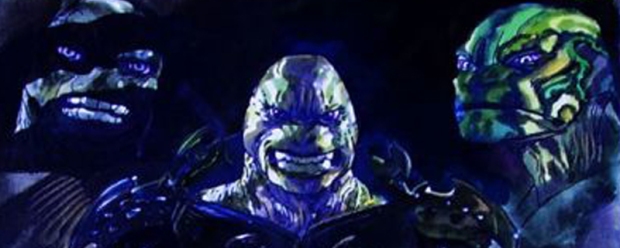
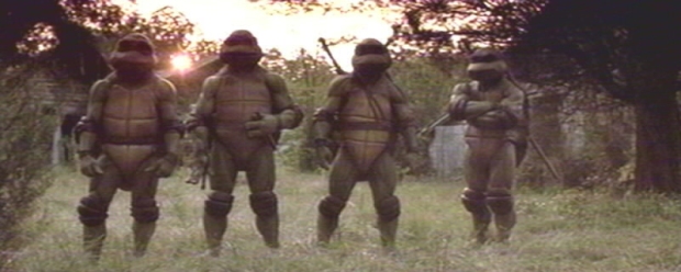
His most prominent work were as designer for the films Highlander, the first live action Teenage Mutant Ninja Turtles, Lost in Space and the Borrowers. He designed and contributed visual gags to the film, Coneheads, starring Dan Akroyd and David Spade.

The remainder of the 90s saw McCarthy working in television, most notably as designer of the break out CGI animated Science fiction TV series Reboot and character creator for War Planets. Reboot was a massive global success and the world’s first long-form computer animated piece, predating Pixar and Dreamwork’s later movies.

In 2003 he was asked to co-write and design Mad Max 4: Fury Road with director George Miller, also creating (with McCarthy listed as Co-writer and designer a surreal CGI animated feature).

In 2004, Brendan McCarthy took a years sabbatical and accidentally created the modern artist’s bible, Swimini Porpoise, an illustrated visual autobiography of his original art and design work, with the help of Steve Cook (artist, photographer, graphic designer). Released in 2005 in the UK as a limited artists edition it sold out within weeks. This very rare book is now considered a holy grail to collectors.

McCarthy featured in the final issue of DC Comics Solo, offering new takes on The Flash, Batman and Johnny Sorrow as well as creating a veritable menagerie of homeless, insane and transgendered social outcasts.

In April 2010, Spiderman: Fever was released through Marvel as a new take on Dr Strange.

It can be seen as bouncing professionally from one wild project to the next, McCarthy was easily recognised as the man to present lunacy in an easily digestible form (or take something digestable and make it lunatic). His career has never slowed but has ebbed in and out of public consciousness as his effect has been behind closed doors in many cases or never seen the light of day. His influences shining out of every panel and concept design combined with his innovative and practiced style gave depth and character to beings that otherwise deserve to sit on a psychological mind shelf kept for half formed thought forms – to witness a McCarthy image is to think you’ve had a fledgling memory about something you may have seen and thought was cool as a child though you cannot remember why or perhaps what it was made up of.

Whether a child-faced Death for Jim Henson, a Razor jawed villain in a CGI universe or an apocalyptic death race on the open seas McCarthy sees no limit and refuses to confine his ideas to previous practices and safe premises. As an artist I thank the stars he exists. A surreal and intelligently creative light. With a love of silly hats.