Moon: Build Up to a Comic Book Cover: Part 1

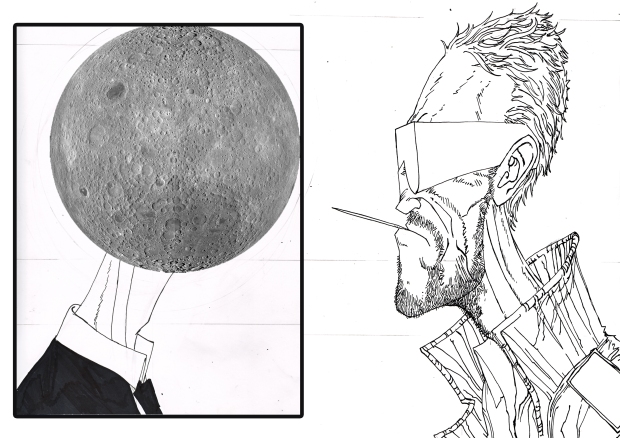
Welcome to the first stages of a very effective comic book cover (we hope). Some years ago I saw something very, very similar between two major characters of some very famous toy brand that had been put out as a fairly successful British comic book. The image seared into my head as one of the strongest images I’d ever seen. As such I have shamelessly sought to use it’s basic premise on the pages of Moon 2.

Covers are probably the most difficult part of the whole process. Something that effectively says what’s going on inside without giving the game away, grabs attention from a distance and holds up well under scrutiny. All this and it always has to carry numbers and titles (and maybe a review and occasionally -though not ideally – a barcode). It takes a tonne of thought and trial and error and has been the focus of my attention for some time.

With the artwork for Moon 2 complete we are beginning to move into the final stages of production (finally). This is a relief and I have to say I’m proud of the content – more so as I see the lettering and colouring come into existence. It’s at this point it becomes easier to figure out what artwork sums up all the takes place inside.

This is stage 1: Pencils, inks, lifted from the page by Photoshop and the basic layer of Moon image (applied on external and high detail images of Moon) to finish off what is effectively nothing but a neck in a suit up until this point.

These lines are with Iv and she will no doubt lovingly finish them off ready for the final page – something I personally can’t wait for. Stage 2 Next week.

Practitioners 6: Carlos Ezquerra

As a catch up for all new visitors to Beyond the Bunker, we’ll be representing the original Practitioners series 1-55 (Simon BisleyChris Bachalo and featuring the most influential comic creatives in history). Thoroughly incomplete but featuring legends like Stan Lee, Jack Kirby, Frank Miller and Alan Moore already more will be hitting the site every two alternate weeks. For now though, sit back every Tuesday for a run-down of the men and women who created the comic industry we know today. (Or check the full list in the menus above). This week: 2000AD Legend and Judge Dredd creator Carlos Ezquerra.

Judge Dredd (2012) is lifted from the early days of Dredd developed but Wagner and Ezquerra

In the modern day of high detail precision artwork Carlos Ezquerra might seem like an odd choice but he is the visual grandaddy of heavy weaponry, science fiction city scapes and the most famous Judge ever to walk the streets of Megacity One, spawning a major movie featuring Sly Stallone and a generation of Judges under the awe inspiring steely gaze of the foremost tough guy in British Comics. It is easy to underestimate the effect that the design work that went into Judge Dredd had as like all genre defining moments it becomes a feature of everything that comes behind it. The weird part is that Carlos Ezquerra wasn’t the first to see his artwork on the title in print.


Carlos Sanchez Ezquerra was born in November 1947, in Zaragoza and has worked under the alias at times of L. John Silver. A Spanish artist who find a home in the British Comics Industry and inspired a generation of young budding artists to pick up a pen and never be scared to draw a weapon at whatever scale we felt like. He loosened the rules and maintained plausibility simultaneously. An emotive and beligerent artist who pummelled the page with aggressive and broad visuals in a very clear and distinctive style,

Be in no doubt that the most easily recognisable British Comic Book character – aside from Desperate Dan and Dennis the Menace (now there’s a crossover we all wanna see) was brought to life visually by Carlos Ezquerra. British Comic book writing legend John Wagner sent Ezquerra a poster of Death Race 2000 with the central character, Frankenstein in black leather on a motorbike as the source of inspiration for the character. Ezquerra sent back Dredd – armoured, leather covered with zips and buckles and the world reknowned badge pinned to his chest. His conceots for Megacity One and the equipment and clothing was deemed too advanced for the title as it was intended and so Pat Mills – who had taken over as writer after Wagner left disillusioned over financial arrangements behind 2000AD – pushed Dredd further into a post apocalyptic future. Now that’s a sign of a great concept designer – advancing the designs so much it alters the original pitch for the better.

Unfortunately for Ezquerra, newcomer Mike McMahon was to introduce Dredd to the world in Prog 2 of 2000AD – Dredd a scrawny shade of his original self. Ezquerra, enraged at being removed from the strip he designed left and returned to ‘Battle’ comics. Until Prog 9 – in which Wagner’s ‘Robot Wars’ story line began with a rotating art team – including Ezquerra. The strength of the storyline saw Dredd become the most popular character in the magazine. Ezquerra’s work became synonomous with the stone faced law man.

While it can’t be argued as faultless – his grasp of anatomy stops at long chins and gollum faces its his lasting legacy that secures him a position in the annuls of comics history. The Dredd and the Strontium Dog he created visually perfectly embodied the strength and hard bitten nature that was needed in the environment that had been developed for him to stride through. Ezquerra, like many other exceptional artists, has a sparing and economical style that carries as much information as his more precise or detailed peers. But its in the simplicity that he communicates better what many others have struggled to in page after page of meticulously rendered panels. When two tough guys walk out onto the Cursed Earth just how many lines do you need? – thankfully Ezquerra’s chosen for you.

A determined and clear minded individual who stuck to his guns as well as any lawman he ever drew – Ezquerra was removed from his post and could have been left to the annuls of comic book history. But he returned and stood out alongside his creation and perservered to receive the credit he deserved. He represents the optimism and determination needed to be a comic book artist, subject to the whims and turmoil of an ever shifting industry.

Practitioners 55: Chris Bachalo

Chris Bachalo has pushed the boundaries of what’s acceptable in modern day mainstream comic books to the extreme. Highly intricate, cartoonish page layouts depict insidious caricatures of popular characters. With blade like precision, Bachalo creates highly detailed dream sequences from whatever writing he’s handed. Forming a visual world of monsters, uggos, bandits and vagabonds throughout his career he has sent out Superheroes dressed for the streets. Pushing the concept of the superhero closer to street level has made Bachalo a hero of mainstream comic book readers deserate for an alternative interpretation of their favourite characters. After almost 20 years working with DC and Marvel (as well as a brief stint on his own title with Image imprint, Cliffhanger) it’s fair to say Bachalo has achieved exactly that.

Bachalo was born in Canada August 23, 1965, Portage la Prairie but was raised in Southern California. Perpetuating the idea that many great comic book artists arrive at their calling because of weaknesses in their preferred fields, Bachalo had grown up wanting to be a carpenter until he discovered he was allergic to dust. He attended the California State University at Long Beach, where he majored in graphic art and illustrated a number of underground comics.

Following graduation, Bachalo found work pretty much immediately with DC Comics. His first published assignment The Sandman #12 (1989) – however he had already been hired as regular artist for Shade, The Changing Man, revived by writer Peter Milligan with a greater adult orientation. With clear black and white definition in his work, Bachalo demonstrated the influences of Sam Keith (artist and writer on Maxx and Zero Girl, with a liquid attitude to realism in his artwork), Bill Sienkiewicz (Eisner Award winning artist and writer best known for his work on New Mutants and Elektra: Assassin, utilising oil painting, collage and mimeograph) and Michael Golden (famous for his work on Marvel’s 1970’s Micronauts as well as his co-creation of characters Rogue and Bucky O’ Hare.

Initially, Bachalo’s work was visibly influenced from many different directions as he began to try to find his own style. This leant itself nicely to Shade as it was a kaliedoscopic, dream-like character and loaded with abstract ideas. Bachalo’s work has always held a certain dark and teenage self-conciousness, reminiscent of rock cultutre of the early nineties – something which strangely has carried forwards with his development – somehow always representing very well the graphic representation of youth at the time. As the design work of a less disenfranchised youth became more assured, brighter and more heavily influenced by street design, graffiti and graphics so too has Bachalo’s work. Most likely coincidental it is this that has catapulted him into the most mainstream family of books there are today.

His early 90s work is minimalist with strong, thick lines, quirky characters and little concern for realism. Never shying away from detailed landscapes but showed a rare inclination towards pages with many small panels, something that deepens any artist’s involvement in a piece.

In 1993, Neil Gaiman selected Bachalo for the Sandman miniseries: Death: The High Cost of Living, starring the Sandman’s older sister. The popularity of Sandman at the time and the strength of the series itself bolstered Bachalo’s visibility significantly. The creative team reunited once again in 1996 for Death: The Time of Your Life. Apart from returning breifly to DC in 1999 for the Witching Hour with Jeph Loeb for it’s Vertigo Imprint, Bachalo’s future lay with the other side of the comic industries fermament. The X-Men were calling.
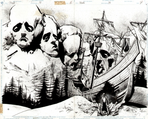
Bachalo’s introduction to Marvel was during his tenure at DC comics, illustrating X-Men Unlimited #1 – an anthology to the ongoing X-Men comic books. Based on the noise generated by his introduction in this book Bachalo ended his time on Shade and made a permanent transition over to it’s big rival. His first project was as part of the forward thinking and innovative 2099 universe, reinventing popular Marvel characters into a corporate nightmare of a future. His particular nightmare blended his own dual fascinations of steam twisted tech and metaphysical beings with Ghost Rider 2099. A technological reincarnation of the Spirit of Vengeance, Bachalo’s rip-snorting, highly detailed blend of twisted perspectives and steam punk edge furthered Bachalo’s influence with what was, otherwise, a more minor title in the 2099 universe. He also drew a cover for Runaways.

It was with Scott Lobdell, Uncanny X-men scribe, that Bachalo introduced a new youth team to the X-canon. Generation X lurched out of the Phalanx Covenant crossover bizarre and idiosyncratic because the creative team wanted to avoid the recent trend in superhero teams, where every member of the team represented a stock character. Generation X became a hit with the series’ namesake due to Lobdell’s realistically cynical and emotionally immature teen characters and Bachalo’s atypical artwork. Bachalo illustrated the series through much of its first three years, taking a break in late 1995 and early 1996 to illustrate the second Death miniseries, Death: The Time of Your Life.

During his time in Generation X, an unusual influence began to appear in Bachalo’s work. While still intricately detailed. Influenced by the unlikely inspiration Joe Madureira, his characters became more cartoony and manga-like, with large eyes, heads and hands. He gravitated towards extremes in anatomy, drawing characters that were previously portrayed as bulky, short or thin as even more so. This elongation, bulk out and caricature of easily recognisable characters in Marvel would make Bachalo a staple and an unusual choice for major events.

In 1997, Bachalo left Generation X folr Uncanny X-men, arguably the industry’s most popular title and his new found inspiration’s previous assignment – where he remained for more than a year until the end of 1998.

In 2000, Bachalo luanched Steampunk, a comic book series deliberately inspired by the genre of fiction of the same name, which emulates early science fiction by intentionally applying self-conciously antiquated and deliberately awkward solutions to modern design. Written by Joe Kelly, the series came under heavy critical fire for it’s obscure artwork, small panels, detailed panels and muddy, dark colouring which many felt made it difficult to tell what was happening. Kelly’s writing at the same time was not as straight forward as many readers would have preferred at the time. Conversely however, the hardened fan base for the title, which was brought out via Image’s creator owned imprint, Cliffhanger, supported it for the same reasons. Regardless, the luke-warm response to the title saw it end prematurely at issue #12 – it’s intended 25 issue run sliced in half. It is currently available in two reprinted trade paperbacks, Steampunk: Manimatron and the perhaps aptly named Steampunk: Drama Obscura.
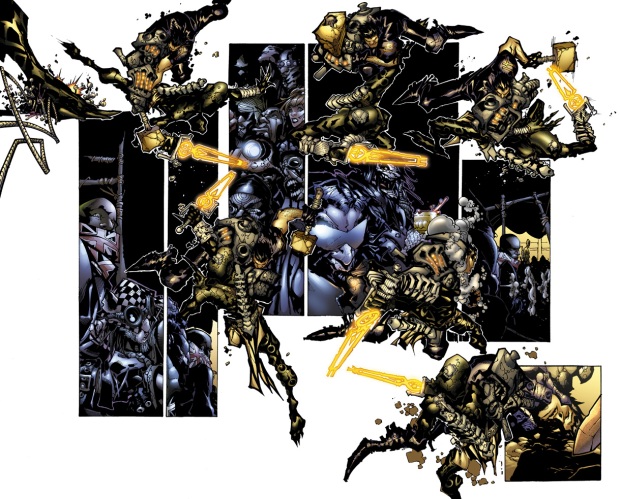
Following his aborted tenure with Cliffhanger, Bachalo returned triumphantly to the halls of Marvel, completing occasional work on various X-men series including the new alternate universe, Ultimate X-men, Ultimate War, Grant Morrison’s New X-Men (collected in New X-Men vol.5: Assault on Weapon Plus and including one of the finest examples of a single issue story). In New X-Men Bachalo realises a scene beautifully envisioned by Grant Morrison in which Wolverine and Sabretooth find themselves at the urinals of the Hellfire Club – a no violence rule allowing a moment of barely contained aggression between the two of them. Bachalo’s combination of clean, crisp lines and perspectives – mixed with the organic, intuitive detailing of the figures and the characteristic elongation and exageration of the two figures brings the light but knowing humour of the scene beautifully forward to such a pleasing degree that it might well be one of the finest combinations of writing and artwork in a Marvel comic book of all time. Not an understatement (though obviously a matter of opinion) and the sequel to the Age of Apocalypse Crossover.

Bachalo's current assignment - the X-Men come of age in Wolverine and the X-Men

Bachalo was also the artist on Captain America for 6 issues (21–26, running December 2003–May 2004 cover dates) pencilling a divisive run written by Robert Morales. In an attempt to humanize Steve Rogers, the pair managed to split fans opinions fairly resoundingly with both leaving the title – Morales 10 issues short of his intended contract for the series.

From 2006 to 2008, Bachalo was the artist for the X-Men title along with new writer Mike Carey after completing his final story arc for Uncanny X-Men (#472–474). He was often filled-in for by artist Humberto Ramos, however.
Bachalo has also pencilled (and coloured) a number of cards for the Vs. collectible card game. These have been renditions of both Marvel and DC characters.

On top of his continuing work for Marvel, Bachalo finished issue #7 of Comicraft’s Elephantmen, an issue 4 years in the making. The issue was done entirely in double-page spreads and marks his reunion with Steampunk writer Joe Kelly. The issue’s story, “Captain Stoneheart and the Truth Fairy” also represents Bachalo’s first work outside Marvel and DC since his fill-in issue of Witchblade.
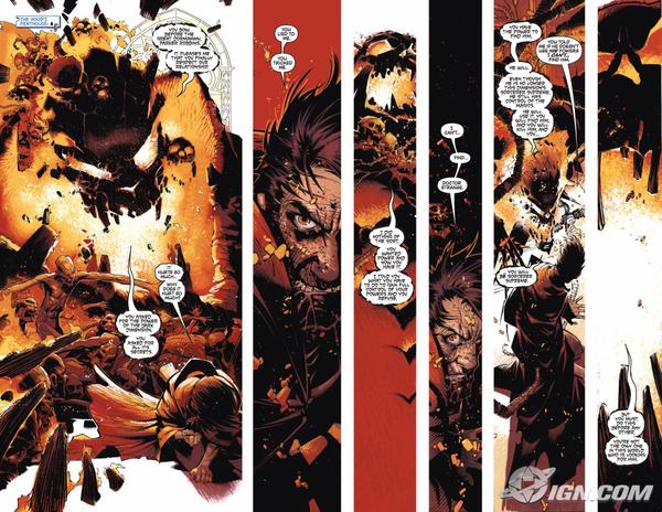
Bachalo has also been one of the four artists who was originally part of the Spider-Man Relaunch. Brand New Day, along with Phil Jimenez, Steve McNiven and Salvador Larroca.

Starting with New Avengers #51, Bachalo will provide variant covers for the creative team of Brian Michael Bendis and Billy Tan to bring use the “Who will be the next Sorceror Supreme?” storyline.

When Richard Friend inks Chris Bachalo’s pencils, the piece is signed “Chrisendo”, a portmanteau of the names “Chris”, “Friend”, and “Bachalo”. Antonio Fabela is a regular colorist of Bachalo’s work.

Pictured some way above is Bachalo’s latest assignment, a critical and fan hit by the name of Wolverine and the X-Men. It’s the next generation of X-Men back at Xavier’s School for Higher Learning under the tutelage of the ol’ canuckle head and it seems pre-fitted to Bachalo’s specific style. Anarchic, high octane and cartoonish, Bachalo’s lavish imagery has found a great home for his brief tenure in these pages. Writer Jason Aaron even going o far as to create BAMFs – small Nightcrawler-esque imps – that create havoc everywhere they go in order to harness Bachalo’s habit of dropping unusual midgets into otherwise mundane panels.

As his graffiti style of comic book art would suggest, Bachalo will leave an indelible and lasting mark that brightens up everything around it. An anarchic and chaotic practitioner – Bachalo is an artist who has caused the mainstream comic industry to adapt to him – something that has furthered the pursuit of great stylistic innovation in mainstream comic books. Bachalo so much pushing the envelope as setting fire to the envelope and feeding it to the little toothy deamons that hide at the edge of his pages.

Practitioners 53: Walt Simonson

Walter ‘Walt’ Simonson is a cheerful poster boy of independent creators within commercial comic books. An exceptional writer and artist, his love and enthusiasm for the boundless scope of possibilities available to any comic writer. His is a mind that smiles wryly at the prospect of turning a God into a frog or constantly bringing back an old idea from school to be enjoyed by many others. Simonson, more than most other artists displays an enthusiasm reminiscent of a boy. While most adults have carried the medium away from the stuff of boyhood dreams – Simonson’s work is fuelled by it creating a body of work that remains timeless and universal as childhood itself. Welcome to the House of Fun! Welcome to World of Walt Simonson!

Simonson was born in September 2, 1946. Studying at Amherst College he transferred to the Rhode Island School of Design, graduating in 1972. He found work almost immediately, at the age of 26. As his thesis, he created the Star Slammers, which was released as a promotional black and white print in 1974 at the World Science Fiction Convention in Wahington DC (also known as Discon II). A decade later the Star Slammers returned with a graphic novel for Marvel Comics, the standard of the work strong enough to go straight to mainstream publication. 10 years later, the Star Slammers returned renewed with the fledgling Bravura label as part of Image. His is the story of an imaginative artist with his own ideas, and ones that survived decades. He has won numerous awards for his work, influencing the art of Arthur Adams and Bryan Hitch.

Effectively bulleting straight out of education and directly into work, Simonson’s first professional published comic book work was Weird War Tales #10 (Jan. 1973) for DC Comics. He also did a number of illustrations for the Harry N. Abrams, Inc. edition of The Hobbit, and at least one unrelated print (a Samurai warrior) was purchased by Harvard University’s Fogg Museum and included in its annual undergraduate-use loan program. However, his breakthrough illustration job was Manhunter, a backup feature in DC’s Detective Comics written by Archie Goodwin.

Recalling in a 2000 interview, Simonson recalled that “What Manhunter did was to establish me professionally. Before Manhunter, I was one more guy doing comics; after Manhunter, people in the field knew who I was. It’d won a bunch of awards the year that it ran, and after that, I really had no trouble finding work.” Simonson went on to draw other DC series such as Metal Men and Hercules Unbound.

A page from Thor revealing the close collaboration between Simonson and his letterer, John Workman.

In 1979 Simonson and Goodwin collaborated on an adaptation of the movie Alien, published by Heavy Metal. It was on Ridley Scott’s Alien that Simonson’s long working relationship with letterer John Workman began. Workman has lettered most of Simonson’s work since. It’s a highly collaborative unity, both professionals understanding the requirements of the job; Goodman’s lettering fitting seamlessly among the bombastic and dynamic panel arrangements.

In Fall 1978, Simonson, Howard Chaykin, Val Mayerik, and Jim Starlin formed Upstart Associates, a shared studio space on West 29th Street in New York City. The membership of the studio changed over time.

In 1982, Simonson and writer Chris Claremont produced The Uncanny X-Men and The New Teen Titans Intercompany cross-over between the two most successful titles of DC and Marvel. This would undoubtedly have been a premium title given the popularity of both parties and both companies selected quite deliberately an exciting and safe pair of hands. The additional excitement that Simonson’s graphic and powerful layouts and fun style perfectly matched such a deliberately populist title, making it a valuable asset to anyone’s collection.

However it is on Marvel’s Thor and X-Factor that Simonson is best known (the latter being a collaboration with his wife Louise Simonson, who he married in 1980 and who herself would become writer on Superman titles). Walt Simonson’s brilliantly wild imagination thudded beautifully against Thor’s mythological and fundamentally otherwordly content. He took almost complete control of the title, famously changing Thor into a frog for three issues and introducing one of the most distinct characters in the Marvel Universe, the Orange, Horse Skulled, Thor matching Beta Ray Bill, an alien warrior who unexpectedly became worthy of Thor’s hammer, Mjolnir – both characters making a lasting mark on the Marvel character landscape. Starting as a writer and artist in issue #337 (Nov. 1983) and continued until #367 (May 1986), he was replaced by legend Sal Buscema as the artist on the title with #368 but Simonson continued to write the book until issue #382 (Aug. 1987) to great success.

Simonson left Upstart associates in 1986. In the 1990s he became writer of the Fantastic Four with issue #334 (Dec. 1989) and three issues later started pencilling and inking as well (accidentally the exact issue he started on Thor).

He had a popular three issue collaboration with Arthur Adams. Simonson left the Fantastic Four with issue #354 (July 1991). His other Marvel credits in the decade included co-plotting/writing the Iron Man 2020 one-shot (June 1994) and writing the Heroes Reborn version of the Avengers. His DC credits over the same period were Batman Black and White #2 (1996), Superman Special #1 (writer/artist, 1992) among others. For Dark Horse he was artist on Robocop vs Terminator #1-4. His distinctive, thick lined work matching perfectly the heavy metal nature of the storyline and central figures.

But he continued to dart seamlessly between writer and artist, never having to seek a project. His was a cheerful bounding from one distinctive project to the next across some of the greatest heroes in history.

In the 2000s Simonson has mostly worked for DC Comics. From 2000 to 2002 he wrote and illustrated Orion. After that series ended, he wrote six issues of Wonder Woman (vol. 2) drawn by Jerry Ordway. In 2002, he contributed an interview to Panel Discussions, a nonfiction book about the developing movement in sequential art and narrative literature, along with Durwin Talon, Will Eisner, Mike Mignola and Mark Schultz.

From 2003 to 2006, he drew the four issue prestige mini-series Elric: The Making of a Sorcerer, written by Elric’s creator, Michael Moorcock. This series was collected as a 192 page graphic novel in 2007 by DC. He continued to work for DC in 2006 writing Hawkgirl, with pencillers Howard Chaykin, Joe Bennett, and Renato Arlem.

His other work includes cover artwork for a Bat Lash mini-series and the ongoing series Vigilante, as well as writing a Wildstorm comic book series based on the online role-playing game World of Warcraft. The Warcraft series ran 25 issues and was co-written with his wife, Louise Simonson. As a mark of his considerable impact on Marvel’s most recognisable Norse God, in 2011, he had a cameo role in the live-action Thor film, appearing as one of the guests at a large Asgardian banquet. Simonson serves on the Disbursement Committee of the comic-book industry charity The Hero Initiative.

Simonson inked his own work with a Hunt 102 Pro-quill pen. He switched to a brush during the mid-to-late 2000s, and despite the disparity between the two tools, Bryan Hitch, an admirer of Simonson’s, stated that he could not tell the difference, calling Simonsons’s brush work “as typically good and powerful as his other work.” This is reminiscent of other master artists, such as Joe Quesada, who moved to digital penmanship from the original pen. To completely alter your tools without affecting your work is an incredibly difficult thing to achieve, particularly to a discerning eye such as Hitch’s.

Simonson is a cheerful and active character in the comic book industry. His technique is impeccable, distinct and miles ahead of his peers. His was a bombastic, thick-lined and crystal clear world. His visuals developing to meet the WAM BAM impact of 90s comics. He was a capable enough artist that at all times he appeared to be a much younger, much more modern artist. His was the legacy of the double page spread, the high impact panel and the perfect blend of effective technical skill and instinctive, intuitive and timeless visuals. More than anything Walt Simonson is fun to read and fun to look at. It’s an undervalued quality. A Simonson piece has the effect of a circus poster, triggering simple, cheerful reactions of universal ideas. His sense of humour permeates everything, his artwork bound ideas off the page.

Simonson’s distinctive signature consists of his last name, distorted to resemble a Brontosaurus. Simonson’s reason for this was explained in a 2006 interview. “My mom suggested a dinosaur since I was a big dinosaur fan.”

Says it all really.

Moon 1.3 – the full process

Moon Page 3. Perhaps the image that went through one of the most extensive additional design work. It passed backwards and forwards between myself and Iv as a black and white, a colour and finally a graphically enhanced image. As it is effectively a one panel page it was a great opportunity to stretch ourselves a little and Page 3 is probably one where I genuinely feel the finished product appeared as it had originally been attended. It also confirmed that myself and Iv knew what we were doing… (at least vaguely)

The original inks. Drawn over pencil line work to decide layout and composition and the finer details. Fairly basic stuff. A detailed description of what we were looking for was sent over to Iv.

Iv applied her own artistry to the page, adding her own ideas to the tones and hues – something she always does really well. In particular, the decision to take the plain black of the sky behind and make it a more interesting blue. The figures at the base of the main image were intended to be uplit red / yellow. However Iv lit them blue to tie them together with the main image and not undermine the central Moon deity figure. It also sets apart beautifully the main abstract poster image and the bottom panel. These are her colours as they were returned back to us before I got my greasy mitts all over them again. Iv is an unnaturally talented colourist and a pleasure to work with.

Next some graphics to enhance the basic colours. Taking existing constellations, one is a lifted selection from astronomoical photography and the other is painted digitally using the template of the original constellation taken from a low res image. I think this one is in CMYK (the standard format you have to put it in to go to print – Cyan, Magenta, Yellow, Black (K for some reason)) so the colours are bleeding and the colour map has altered slightly but it is still the same image as the others….

… and slap on some lettering using Illustrator and finishing in Photoshop by creating layers and slicing and placing elements behind the central figure. Otherwise the linking branch of the speech bubble would really detract. Et voila. Page 3 of Moon 1. More of the same coming soon. Danke.